Website restyle
01 March 2019Nearly two years after the last site redesign I have decided to change the look of this website. Whereas the last change was technically extensive it was essentially a reimplementation of my previous long-standing menu-at-left layout using CSS rather than images — this time round the change is technically simple, but it finally drops a presentation I have used ever since I got the remy.org.uk domain. With spare time being a commodity in the near-future I am considering the changes I thought about with previously — such as the URL scheme — but decided not to implement.
Back to a single view
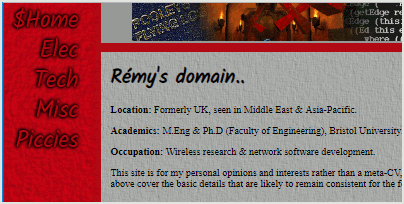
The use of alternative style-sheets to implement the two different website views and using different sub-domains —www.remy.org.uk and m.remy.org.uk for desktop (shown below) and mobile respectively — was a good way of reducing the logistical complexity that the previous site setup had to cope with, but choosing to view mobile vs. desktop remained a manual process. At the time for whatever reason I chose not to setup my webserver to do browser detection and force mobile browsers to the mobile site and desktop users to the desktop site — I suspect figuring out an intuitive override system was my major concern, especially for desktop users wanting to view the mobile site. I did not realise it at the time but Firefox seems to be one of only a few browsers that has easy switching between style sheets out of the box — Chrome/Chromium requires an extension.
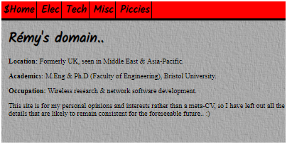
In practice I found that I almost always used the mobile view (shown below) even on desktop systems, and having a menu down the side rather than the top has historically been surprisingly difficult to get right. In any case the “mobile” view was not properly setup for mobile browsing, and in hindsight having multiple views was really a cop-out from being indecisive about how the site should appear. The last iteration cleared out a lot of the resulting logistical complexity, and this time round I finally decided to let go of a basic layout I had dogmatically used for as long as I can remember. The last straw was the relative expense of an SSL certificate that included the mobile sub-domain compared to just the main domain with and without the www prefix.
The banner
From digging through various archives my best guess is that my old-style “advertising” banner — shown below — became a part of my personal website in 2003, but it was made back in 2001 as part of a graphics coursework. At the time468x60 pixels was a standardised advert size, and the coursework was to make a pair of images, of which this advertising tile was part of the pair I made. Keep in mind that at the time 800x600 was considered a good resolution, so these banners were considered big. It makes reference to flying, Quake 3, and Haskell programming — all three things that I was doing 15-20 years ago but are now of minimal relevence.

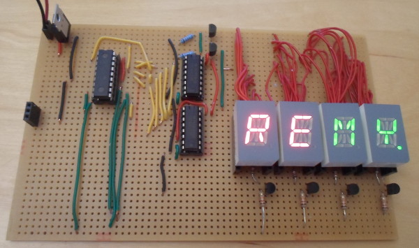
The new banner graphic is of a circuit board (shown below) I made around April last year, and given how much electronics is now both a major interest and hobby of mine, using this circuit as the header of my website is something I have thought about for some considerable time. At the time I was creating the circuit I considered laborious rather than ambitious, since it involves a lot of wires but very few actual components, but I felt it was far better than any other circuit I had made to use as a banner image.
Content changes
Although these days I do not treat articles as immutable, I still adhere to the rule that the information should remain unchanged, hence a general reluctance to update articles and even then I make it obvious that there has been an update. Over the years I have done clean-ups to the HTML, including adding in missing references in links and standardising CSS styling, as well as correcting many spelling errors. However off-site dead links I have left as-is because of the general difficulty of finding an alternative reference. Some of what I have written in the past is a bit cringeworthy but there is very little I would consider censoring, and even in these instances it is due to the presentation rather than the message.However in terms of content there has been major changes to the pictures section, and these changes happened some time ago — in the distant past the vast majority of the galleries were of university society events back in the mid-to-late 2000s, with trips to Alton Towers well-represented, and I have decided to finally remove all of the galleries that bare no resemblance nor relevance to my current life. I have kept a few pre-2010 galleries that relate to non-university events, but my general inclination is to retire content that is more than a decade old, which includes all the galleries that also had video. I have thought about getting rid of the picture section entirely since I do not really maintain it, but what galleries are left are time-less ones which I felt best left in place.
Possible technological changes
For all its faults from a performance, resource usage, and deployment perspective PHP has always come out as the best choice of underlying web technology. I had thought about switching to Python — either using Django or using a custom-buit application server using FastCGI — on the basis that it is a programming language I actively use professionally, but looking into it such a move seemed to create more issues than it solved. A custom C or C++ back-end looked like it would end up being more trouble than it was worth. An alternative would be to go completely static, but the heavy dose of URL rewriting rules required to avoid breaking links would be a major can of worms. Nevertheless in the longer-term I would like to switch from using?elec=1550966400 to something more like /elec/19b24 but without rewriting every single article and/or making some sort of automagic redirect I am stuck with the coding currently used for articles.