Fixing up Firefox + NoiaButtons
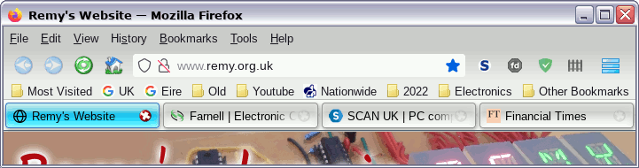
17 October 2022This is an update to the previous Firefox tabs-below-navigation fixup since once again Firefox has broken things and I have had to yet again spend a day or two working out how to get things back to the way they should be, and that way is shown below — some may recognise this as what was once the Noia Fox theme and I have long forgotten when I started using it. For some reason Mozilla fail to understand that people like me don't want the tabs running along the top and they seem to go out of their way to break customisations that put them below the bookmarks.
The fixup
Fortunately the NoiaButtons Theme has now integrated buttons-at-bottom hacks so at least this time round all I needed to do was delete my previous.mozilla/firefox/*.default/chrome/ directory and make a fresh one with just the content of the NoiaButtons theme.
The userChrome.css is pretty much just the stock one with one option enabled and some extra lines of custom code that fix up a few other residual annoyances — with all the comments and disabled options stripped out mine looks like the following:
@import "./css/toolbar_buttons_noia.css"; @import "./css/toolbar_buttons_reduce_size_on_hover.css"; @import "./css/toolbar_buttons_size_on_navbar_auto.css"; @import "./css/noiaui_light_tabs_below_navigation_toolbar.css"; /* Nice folder icon in bookmarks */ .bookmark-item[container] { list-style-image:url('folder-item.png')!important; } /* White location bar background */ :-moz-any(#urlbar-background, #urlbar-input-container,.urlbarView-body-inner, #searchbar, .searchbar-textbox) { background-color: white !important; }
Bookmark folder icon
I dislike the icon the bookmark toolbar uses for folders, although I have long-forgotten whether Firefox have changed the icon or the one I am used to seeing was always a custom one — most likley the latter. Anyway I was put on the right track by finding a snippet the changed the folder colour and I modified it to load an image instead. Thefolder-item.png I used is below and copy it into the same directory as userChrome.css in order to use it, although I am considering going on the lookout for a better one.
![]()
Tweaking the URL bar
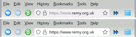
The other tweak I made was to make the URL bar completely white rather than the default slightly grey background, and the difference is shown in the two screenshot snippets below. It is only a slight difference but I found that the sharper contrast to be a substantial improvement, especially on higher resolution displays. Ideally I would like a black hairline border but I have not had the time to dig deeper into the CSS.